Thanks for these awesome suggestions! You’re reading our minds—many of these are already in the works!
Here’s a sneak peek: A revamped transaction history page with the latest transactions on top, filtering options (date, type, ticker), and (filtered) downloads in Excel/PDF. Detailed Transaction History statements with commissions and fees clearly shown. XIRR to analyze returns better.
It’ll take some time to go live, but we’re on it! Keep the great ideas coming.
Dark mode is a hot topic in our internal discussions right now—your vote adds more weight to it! While we haven’t started work yet, we’re definitely keeping it in mind. Thanks for the suggestion!
INR portfolio value? Yes, please! It’s a popular request (even I keep converting USD to INR on my calculator). We’re talking about it already, so stay tuned!
Tax Implication calculator noted—thanks for the great idea!
Please add more stock to buy during pre-market. Lot of times important news comes before the market opens and there is lot of scope for more returns for those news driven stocks. Currently I see not all stocks are available during pre-market , I already missed couple of opportunities
Thank you for attending and responding to my suggestions. This kind gesture of yours makes the user feel important.
Regarding the technical glitch part mentioned by me in the point 04, I shall send a detailed response. I am sure this is a very small glitch and can be resolved by the excellent technical team at Vested.
The current user interface for buying, selling, and tracking portfolio price changes requires multiple clicks and is not user-friendly. Vested Finance needs to keep up with its peers in the marketplace.
Consider implementing a voting system for feature requests to prioritize what to develop first and identify what matters most to Vested Finance customers.
The current user interface is broken. When i goto watchlist and sort them in a particular order and do a transaction, it goes thru a couple or more pages and then it gets back to the watchlist where the sort order is dead.
The DIY vest - when modifying the vest, if i want to increase the weight of an existing stock, it doesnt adjust the other weights to keep the whole as 100. This is meaningless. If i have a vest of 2 stocks (i.e. 50% each) and if at a later point i want to add a 3rd stock, when i add the new stock, it should automatically adjust the weights of the others but here when i add the new stock, the overall starts showing >100 which is invalid. There is a lot to ask for in terms of correction and bug fixes. I have already shared video recordings of the screen and voice over and I am yet to hear an acknowledgement. I have reported a lot of things over email over the course of time but still waiting to see the real thing. The recent change is good but ridden with bugs.
Thanks for sharing this (and for sticking with us)! The sorting reset on Watchlists and DIY Vest weight adjustment are definitely things we need to improve. We’re looking into it and will also check on the videos you sent. Really appreciate your patience—your feedback helps us make Vested better!
@Vikram_Horizon_943
Got it! Showing invested & return values in INR is a popular request, and we totally see the value in it. We’re discussing it internally—so stay tuned!
Hi, I am currently using Federal Bank savings account, Lastly when i invested in Vested i had invested using SBM bank account option in the year 2022, Now to invest more i need to have seperate account with HDFC, Or ICICI or Axis for it to be easy. or go through the online net banking process which is hectic and tedious process.
Why don’t you partner with federal bank for easy investments and making everything simpler.
“INDMONEY” had already partnered with Federal bank for provinding the transfer of funds directly to Drivewealth account using UPI or from the Banks app. Even they provide direct purchase of US stocks from their app.
Since i am using vested and wanted to stick with vested, can you try integrating federal bank to your indian banks ecosystem so as to make investment journey simpler.
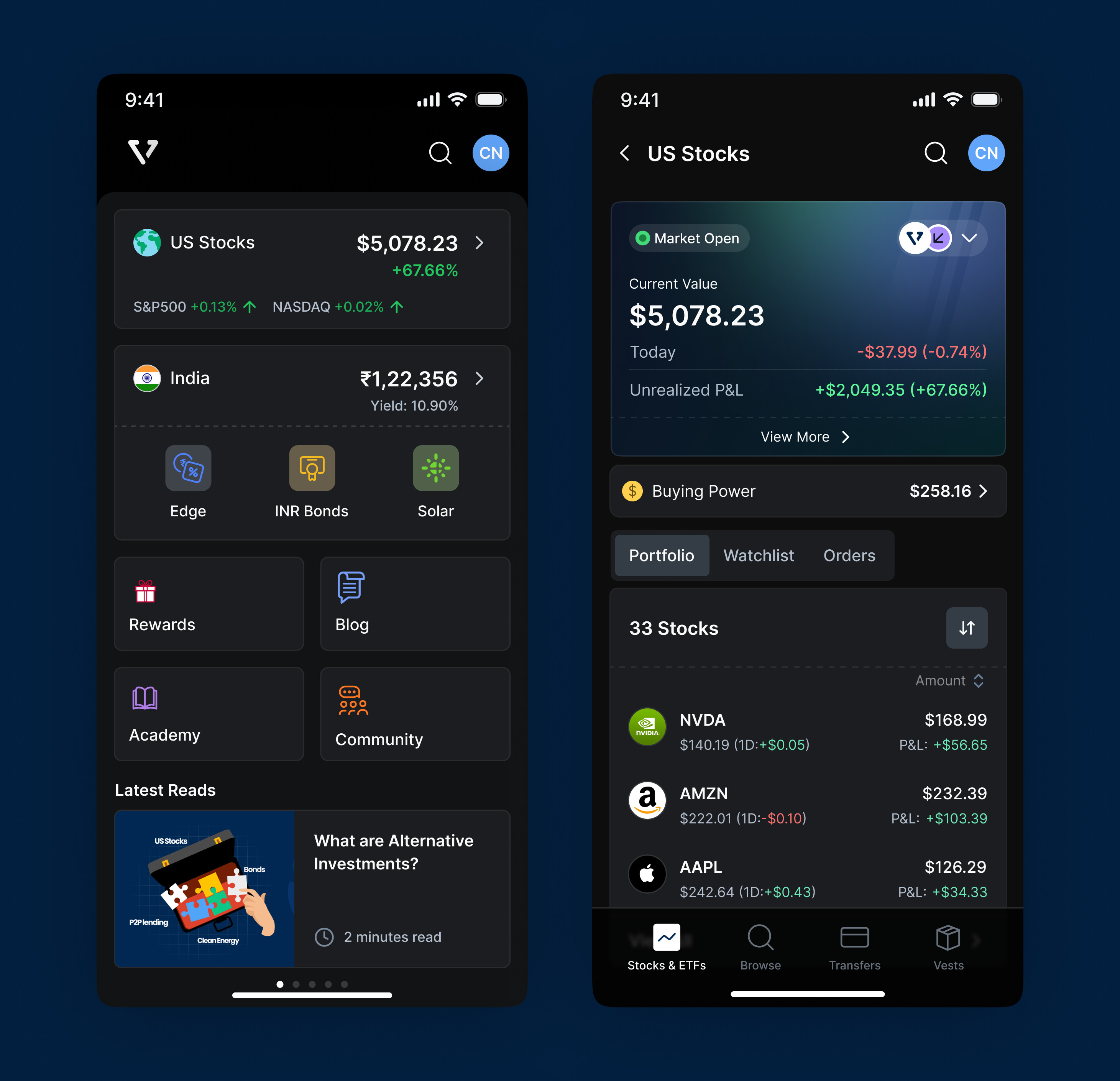
In the portfolio screen by default only 10 stocks are displayed. To see all I have to tap on View all. 10 is very less. Increase the limit to 25 at least. That would avoid one extra tap.
In the Portfolio screen, the bluegreenish box is occupying lots of unnecessary space.
When you tap on ‘View more’ button in the bluegreenish area, it is currently showing a small popup in the bottom area. Instead of that navigate to the same screen that opens when you tap on ‘View All’ button in the bottom of the stocks. This way the users can see additional details such as investment vs return, sector wise allocation, etc.